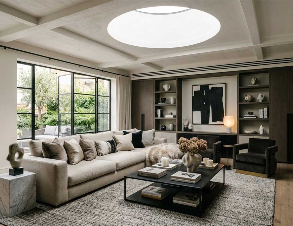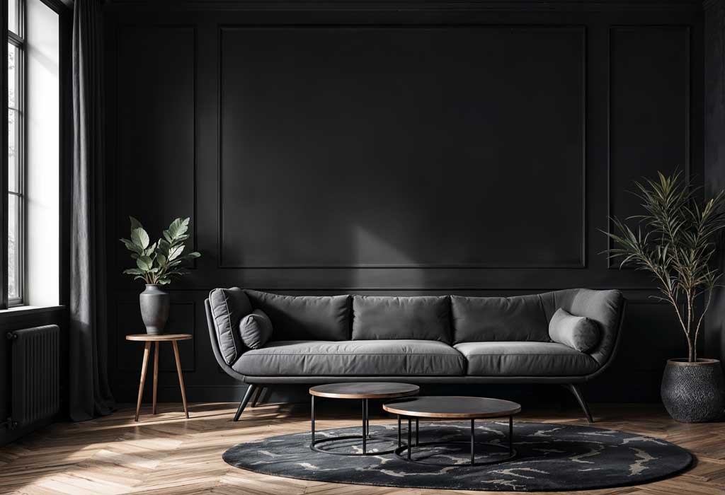

There is a particular kind of interior where everything appears to have been bought at the same time. The sofa matches the armchairs, the coffee table matches the side tables, and every timber finish appears to have been selected from the same sample board.
Technically, everything works together. Visually, however, the room can feel strangely flat.
One reason designers often combine different furniture styles, materials and periods is that contrast gives an interior depth. A contemporary sofa can look considerably more interesting alongside an antique chest, while a traditional dining table can provide warmth in an otherwise modern room.
This does not mean randomly filling a room with mismatched furniture. There still needs to be some form of visual relationship between the pieces.
Colour is one way to create that connection. Different furniture styles can feel cohesive when they share a restrained palette. Materials can do the same. Walnut, oak and painted timber may have very different appearances, but repeating related natural tones throughout a room can tie them together.
Scale matters, too.
A room full of small furniture can feel fussy, while a collection of large pieces can become visually heavy. Combining substantial anchor pieces with smaller occasional furniture creates variation and allows the eye to move around the room.
Texture is another useful layer. Smooth contemporary upholstery beside rough timber, woven textiles or aged metal creates a more tactile environment than a room where every surface has the same finish.
This approach is particularly effective when furnishing a home gradually. Instead of trying to make every purchase match an existing scheme, each new piece can be considered for what it contributes to the room.
It also makes interiors feel more personal. A chair inherited from a relative, a vintage side table found at an auction or an unusually shaped lamp can give a room a sense of history that is difficult to achieve with an entirely coordinated furniture collection.
The aim is not mismatch for the sake of mismatch. It is controlled contrast: enough variation to make a room feel collected, without losing the sense that everything belongs there.
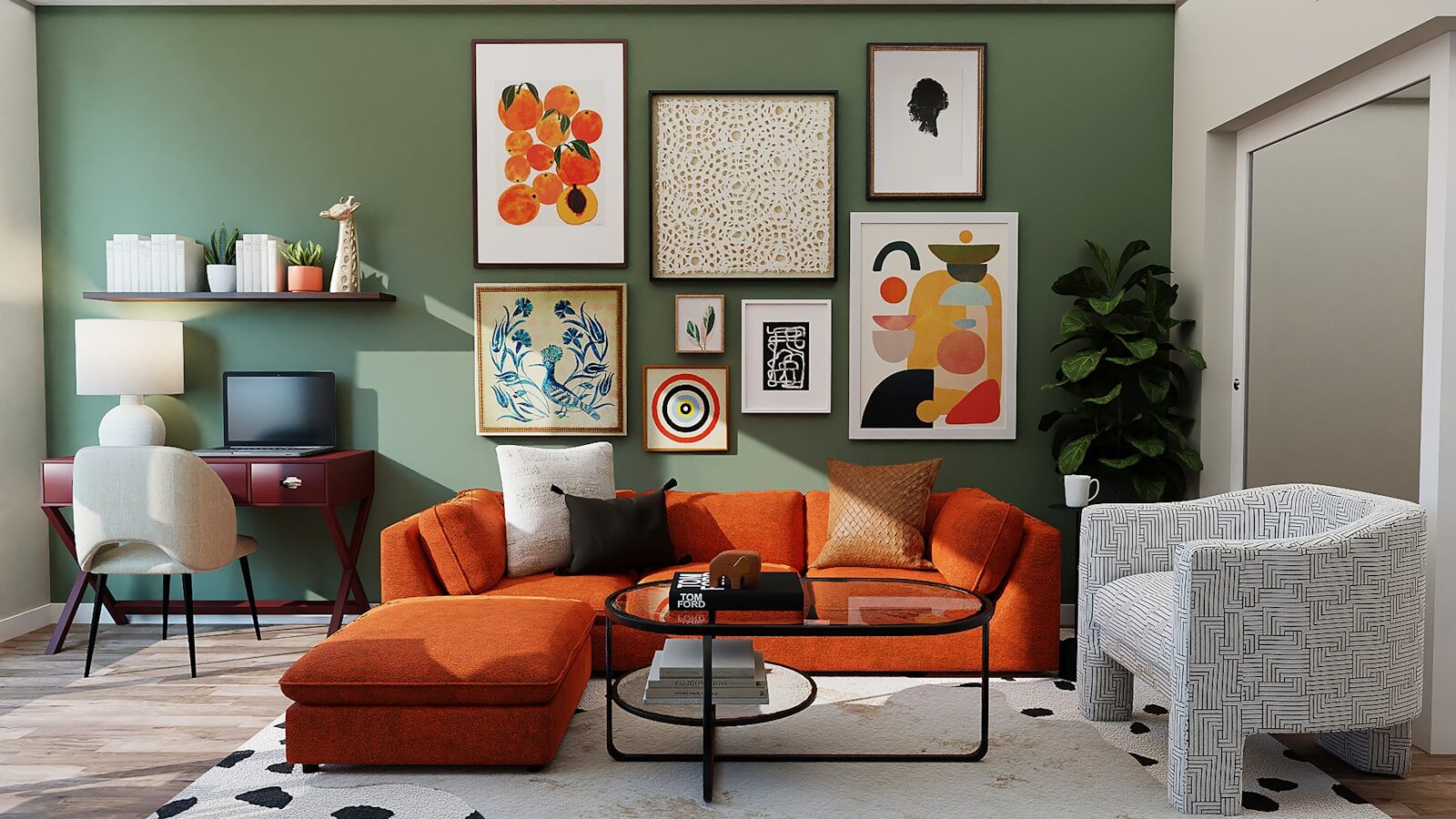
Photo by Spacejoy.